Wednesday, 3 December 2008
Days with my father
This site touched me on a personal level. I lost my father this year and now I worry sometimes about what I will do when my mother is old, looking at this site has made me realise how important it is to record everything I can so I can remember her when she is gone.
Thursday, 25 September 2008
The Biggest Drawing In The World
I stumbled upon this project several months ago. The basic idea is that using a GPS receiver one could make a self portrait over the entire world with the GPS route acting as a pen. With the project Erik Nordenankar released a video of him travelling with the receiver in various parts of the world culminating in a big pile of delivery notes and a plotted chart of the effects.
Unfortunatly the project was announced to be a work of fiction. Nordenankar had produced it as a graduation project for a graphic design and advertising degree and had always planned it to be a fictional piece due to budget constraints
Even so the project was one that put a big smile on my face when I saw it and the fiction was good enough to make me think the whole thing had been done as a publicity stunt for DHL
Thursday, 18 September 2008
It has the power to move you
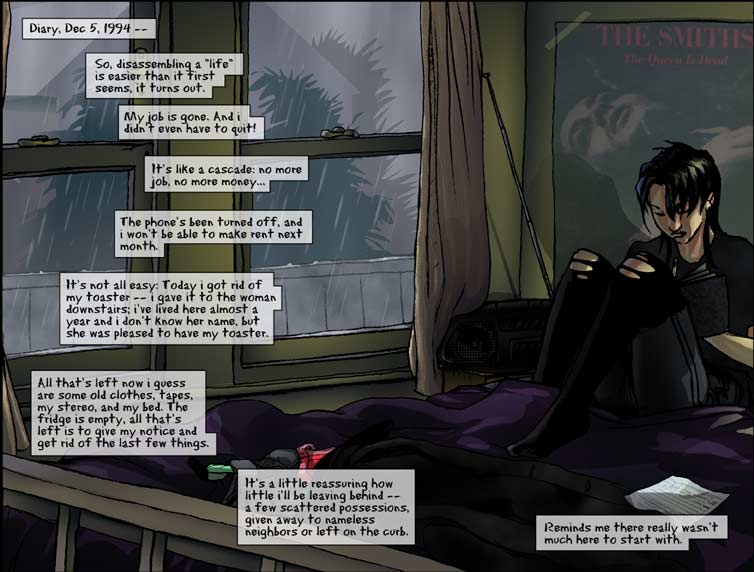
Its strange how a simple story told well has the power to move so many people. This comic has been doing the rounds since about 2006 and is still bounced around from time to time. The original story can be found here. From here it was converted into a comic and made its way onto ytmnd.
 I first saw it it struck me as a lovley little story not only focusing on the love of a parent but also how games can be a real aid to those who are housebound.
That was a long time ago, before my father passed away. Now when i read it its the last line that really gets me
"Show your parents as much love as you can, while you still can guys"
Because its true
Friday, 12 September 2008
Riceboy (or how i learned to stop worrying and love the one electronic)
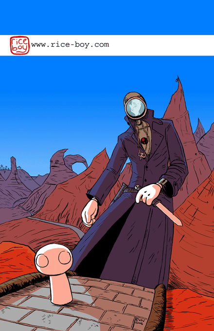
 Over the past few years I have aquired a pretty big reading list of webcomics, ranging from simple dilbert updates (there funny because there true) to the rambling epic that is Megatokyo. Although many of these have become firm favorites I can think of only a handful that have held such grace and wonderment as Rice-boy.
 Riceboy itself takes place on a surrealistic world known as Overside. Here agents, The One Electronic and Calabash on a 3,000 year quest seek "The Fulfiller" a mystical figure who will unite the world.
The figures in the story are to say the least surreal with all manner of multi legged creatures aiding and hindering our heroes thoughout the jorney.
The author Evan Dahm has succeded in creating a strange and enchanting tale, an epic that uses its sheer strangeness to combat the po-faced seriousness that often plagues fantasy epics.
Sunday, 7 September 2008
The lost art of the low rez

When i was a kid games had pixels the size of a babys head, 800x600 resolutions were this weird holy grail and PC screens were about 15" and an 8mb graphics card was the talk of some kind of babbling futurist madman.
But these limitiations caused a strange thing: good bright designs. Think about your favoite games pre 2000, think about the mario games, the sonic games, theme hospital/park. these were games where being bright and clear to make things out wasnt just nice, it was vital to there funciton. Now look at Gears of War, brown men on grey worlds killing brown and grey monsters.
I've herd software designers working in 1990 talk about how starting small forced them to make correct design decisions. maybe we in our world of high-def screens, phong shading and textured bump mapping have indeed lost something: how to make a good, simple design
Tattoo Woman
Its been a while since I put a post up on the blog, i suppose nothing really has caught my eye, nothing has screamed out at me. So I thought that I would blog about something old rather than something new.
This photo is something that i feel has come to define my career, the hits it gets on flickr outnumber any other photo i've taken at least 10 to 1, its been submitted for competitions and was chosen for last years photobook, in shot it has dominated everything else. And yet it happned just by chance.
I used to work in a nightclub in Reading called the Fez, basically i took pictures of drunks for there website and got paid in alcahol. Most of the photos were ok, mostly pretty good group shots of people to show to there friends the morning afterwards. But this one came out by chance: I took it in the middle of the dance floor, first one was a dud so i took another, the woman thanked my and dissolved back into the crowed.
So i uploaded it to flickr and immediatly people seemed to warm to it, more and more people viewed it, now it gets between 1 and 4 hits every day.
The thing that made me think of it again was that i saw her this morning, she was standing in front of me at the supermarket and i just diddnt twig to who she was untill i saw the tatto as she was walking out. I couldnt catch up with her and now i'm in a bad mood as i couldnt get her name or more importantly a release form.
Wednesday, 16 July 2008
Because machines want to make music too
Big Ideas (don't get any) from James Houston on Vimeo.
The piece is called Big Ideas (don't get any) and was produced for his graphic design art show. the basic idea was based on the Radiohead track Nude after realising that Radioheads initial public challenge to remix the song was to say the least difficult (its rhythm and tempo clashes with dance music mechanics) he decided to fashion a "band" of sorts out of redundant hardware, in his own words:
"Based on the lyric (and alternate title) "Big Ideas: Don't get any" I grouped together a collection of old redundant hardware, and placed them in a situation where they're trying their best to do something that they're not exactly designed to do, and not quite getting there.
It doesn't sound great, as it's not supposed to."
I'd have to say i disagree with Houstons verdict on the piece, I personally thing it sounds amazing and I would love to hear more work done by this "band"
After reading about this piece i was reminded of an old favorite of mine, IBM 1401: the musical.
Wired did an article on 1401 back in 2007 when it was still touring. The piece is the brainchild of Icelandic composer Johann Johannsson who based the piece on work his father Jóhann Gunnarsson did whilst working with the 1401 mainframe in 1964. Gunnarsson noticed that due to a production fault the 1401 would produce an am frequency which could be read as a tone, armed with this information Gunnarsson wrote programs for the mainframe in order to modulate this frequency thus producing one of the earliest Scandinavian electronic instruments. Armed with his fathers work Johannsson teamed up with dance coriographer Erna Omarsdotti to produce a piece based on the 1401.
Musically the 1401 sounds a bit like a Cello with a definite string feel to it not found in the early synthesisers, this sound is used to produce a haunting ghostlike tune as though the Mainframe is talking from beyond the grave, which, considering The University of Manitoba gave there old IBM a burial, it is
Thursday, 10 July 2008
Stronger than my brother
Photosoc went to Kew a few weeks ago and took are new shiny Sigma 70-300 with us that has a (relatively basic) macro facility on it, this was one of the results.
Artistically it may not be all that (the wilting flower in the background being seen as a bad thing in flower photographing circles) but I think it has character
New Babbage
Second life can charitably be referred to as a wonderland where only the imaginations of its users is the limit and uncharitably referred to as a stuttering rust bucket of a quasi game filled with trolls, furries and griefers.
Nevertheless there are some moments when the old engine can be used for something that will take your breath away. New Babbage is one of those moments. Steampunk is one of the styles that has found a home on Second life allowing enthusiasts a level of freedom not available to them in the real world, here a strange world that comes across as a cross between Rapture and 1890s London emerges from the fog. As well as being an archetectural work the community also works on art, avatars, vehicles etc. There community can be found here
Sunday, 6 July 2008
9
9 Nine Shane Acker Short Animation
Uploaded by FrFKmeron
As usual Stumble upon has dug up a jewel on the internet in the form of 9, a CGI film created by animator Shane Acker.
As Discribed in an interview with www.animwatch.com:
"Inspired by the work of stop motion animation masters Jan Svankmeyer, The Brothers Quay and the Lauenstein Brothers, I sought to immerse the audience in gritty textural world inhabited by creatures composed of fabric scraps and bits of broken machinery.The fantasy artwork of Zdzislaw Beksinski and photographs of European cities destroyed in World War II inspired the scenic design.The non-verbal narrative is loosely based on the old English Poem Beowulf, and relies heavily on pantomime, combined with strong composition and staging to tell the story."
Shane worked on the film inbetween animation gigs for films such as lord of the rings in order to finance the four year production of 9 which he described as an "animation boot camp". 9 has been critical success with nominations a film festivals and even an Oscar nomination.
Tuesday, 24 June 2008
Esao Andrews
 Easo Andrews is a painter/illustrator/designer at Baker Skateboards in New York. His work mostly depicts a series of grotesque/erotic scenes with a very strong focus on creepy yet pretty girls, surrealistic figures and dreamscapes. Dark pastel colours and bug eyed creatures flow though whilst people warp and distort sometimes losing eyes and heads, sometimes growing roots out of there faces.
When interviewed Andrews states that he gets a lot of his current inspiration for characters from women he sees on the streets around where he lives. He has also stated that whilst a lot of his work is erotic it does not come from any specific fetish for distorted bodies, more of a general interest, Andrews tries to keep this element of his work as ambiguous as possible
Andrews also puts a lot of effor into the presentation of his website which has a theme which is changed every few years. Currently the site dipicts a faceless girl on a swing and is shown in light blues reminicent of water or maybe drowning.
Thursday, 12 June 2008
We see things differently around here
I dont really know what i did with the camera but it worked. These are some sort of flowering plant in Harris Gardens at Reading Uni, they actually look totally normal to my eye but this is how the camera saw them, no editing done at all
Tuesday, 10 June 2008
Walls with stuff written on

This site has been around for a while, Its pretty much what it says on the tin.
Whilst there are numerous sites dedicated to graffiti this is one that has always brought a smile to my face. This isnt graffiti as art but graffiti that makes you smile. Images on the site are uploaded by members of the public giving it a weird community feel.
Tuesday, 3 June 2008
Preperation is key
Ok so this is a complete plug of my own work but as none of my current work is mentioned on the blog I may as well start.
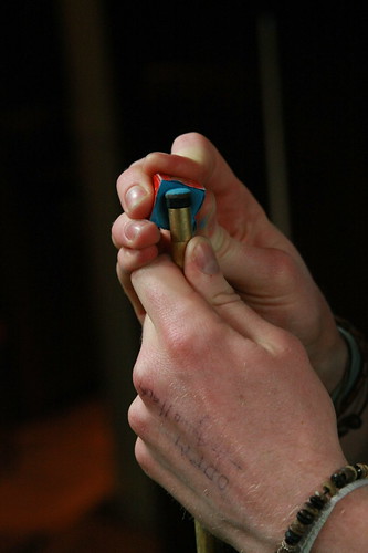
"Preperation is Key" was taken just by chance when waiting between bands at Mojos in Reading Uni.
Garfield without Garfield

Despite this a reader of BoingBoing.net working for Hallmark asked Jim Davis directly about the strip and was told it was a very elaborate Halloween play on a primal fear: the fear of being alone.
From this a new comic has recently been spawned. Garfield without Garfield is exactly what it sounds like, old Garfield strips with the titular orange cat removed. Strangely it works, somehow if you cut out Garfield the strips become bleak and disturbing. Stories about Jim having comedy arguments with his cat become a critique of his loneliness as he slowly loses touch with reality.

One wonders what was going though Jims head when making Garfield caused this nihilist subtext to appear
Thursday, 29 May 2008
Dead webcomics society
And so I'd like to share a few unfinished web comics that have caught my eye over the years
WARNING - of you are the kind of person that is easily frustrated by unfinished stories you might want to turn away now.
The first of these stories is The Right Number a Story by Scott McCloud, a noted comics theorist. It tells the story of a man who after a mixup of numbers between his girlfriend and a strikingly similar looking woman realises that there is a pattern to peoples appearances and personalities dependent on there phone numbers, from here he sets out on a quest to find "The Right Number" The story was to be a three part flash comic using an innovative system where panels moved in from the centre of the previous panel thus drawing the reader in. Unfortunately the story finishes with secition 2 meaning that there is no conclusion. McCloud has claimed that he will one day finish the story but currently that seems unlikley

 The second story is Nowhere Girl. This is a story of one Asian American girls journey of acceptance of her homosexuality and the people she meets after rebuilding her life. Overall the story started off slow but showed a lot of potential. Again this story was cut off after only two editions and there has been no update for three years.
The final story is one that may or may not be dead, currently its unclear if it will ever be finished by I really really hope so as its a personal favourite of mine. Nine Planets without Intelligent Life is the story of two robot production workers called Chris and Ben. One day they notice that the robots on the production line are changing, they are being replaced with the new robot assembler 4000. Whilst most robots would turn themselves in for parts Chris and Ben are fitted with bohemian drive chips (after a drunken bender) meaning that they are capable of wild deviations in behaviour and ideas.

The solar system that Ben and Chris inhabit is a post humanity society where after the last human died content robots decided to continue society without them. These are the worlds that the two robots visit on the longest road trip of there lives. On the way they visit old earth, get nearly shot on mars, meet a town of time travellers and get lost in interplanetary space.
The story has been on the go since at least 2006 and is currently reached a resort somewhere around Saturn, new pages have all but dried up but not completely, there is a chance that the creators will finish the story as there are only three planets to go but if they do is anyobodys guess.
I hope you guys like the three comics i've shown you today
and please dont kill me if you get frustrated by the lack of endings
Friday, 11 April 2008
Light Graffiti

I found this post at abduzeedo.com about light graffiti, i've been looking into this for a while and I've done a little myself. The effect is pretty simple, at night put a camera on a long exposure (film/digital SLRs work better for this) then use a light source such as an LED and literally draw anything you want, you'll have to play about with
the settings but its pretty easy to pick up.

Tuesday, 22 January 2008
Library of Congress puts photos on Flickr

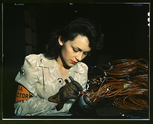
Woman aircraft worker, Vega Aircraft Corporation, Burbank, Calif. Shown checking electrical assemblies (LOC), originally uploaded by The Library of Congress.
The US library of Congress has started putting photos from there extensive collection up on Flickr. At the moment the only things up are the some reporting photos from about 1910 and some stuff from the 30s and 40s.
The photos look a little surreal at first due to there clarity and detail, they look as though they have been redone using modern day models, i suppose this is because were so used to seeing black and white film from the time rather than full colour photos.
This particular photo is my favourite, somehow the woman's hair, blouse and lipstick look out of place with the heavy industrial gloves she is wearing.
overall its an interesting project and i look froward to see what will be put up next, the entire collection can be found here


